UX/UI DesignFashion · E-commerce
Sant Antoni Clothes
Good traffic, but the site wasn't converting it.
- Client
- Sant Antoni
- Year
- 2026
- Engagement
- Ongoing
- Services
- UX/UI Design, CRO Strategy, Web Design, Custom Features
The context
Good traffic, but the site wasn't converting it.
Sant Antoni's e-commerce experience needed to turn browsing into buying. A confusing product grid, buried actions, inconsistent typography, and checkout friction were getting in the way of conversion.
- Deliverables
- UX research and CRO strategy
- E-commerce UX/UI redesign
- Mobile-first design
- Updated color palette and typography
- Unified button criteria
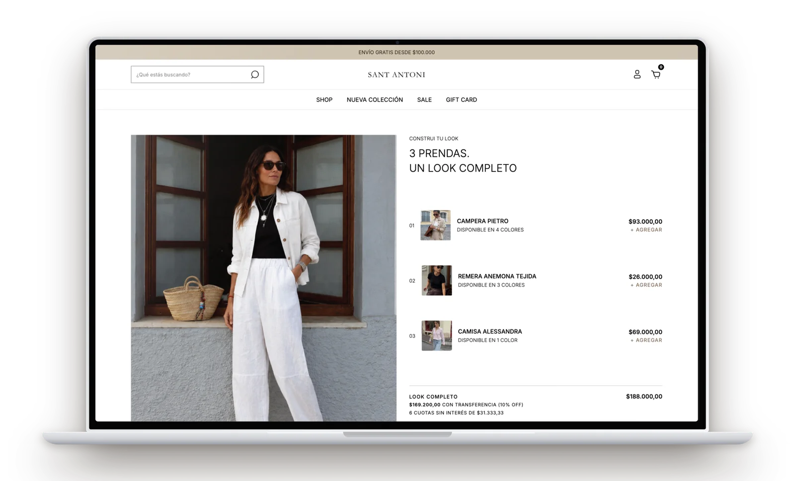
- Custom “Get the Look” feature
- Campaign landing pages
- SEO-focused blog

Our approach
The problem
A confusing product grid, buried actions, typography that didn't reflect the brand identity, and checkout friction made the shopping experience harder to navigate and complete.
The objective
Improve the shopping experience and conversion flow through clearer navigation, a more consistent visual system, and a more intuitive path to purchase.
The solution
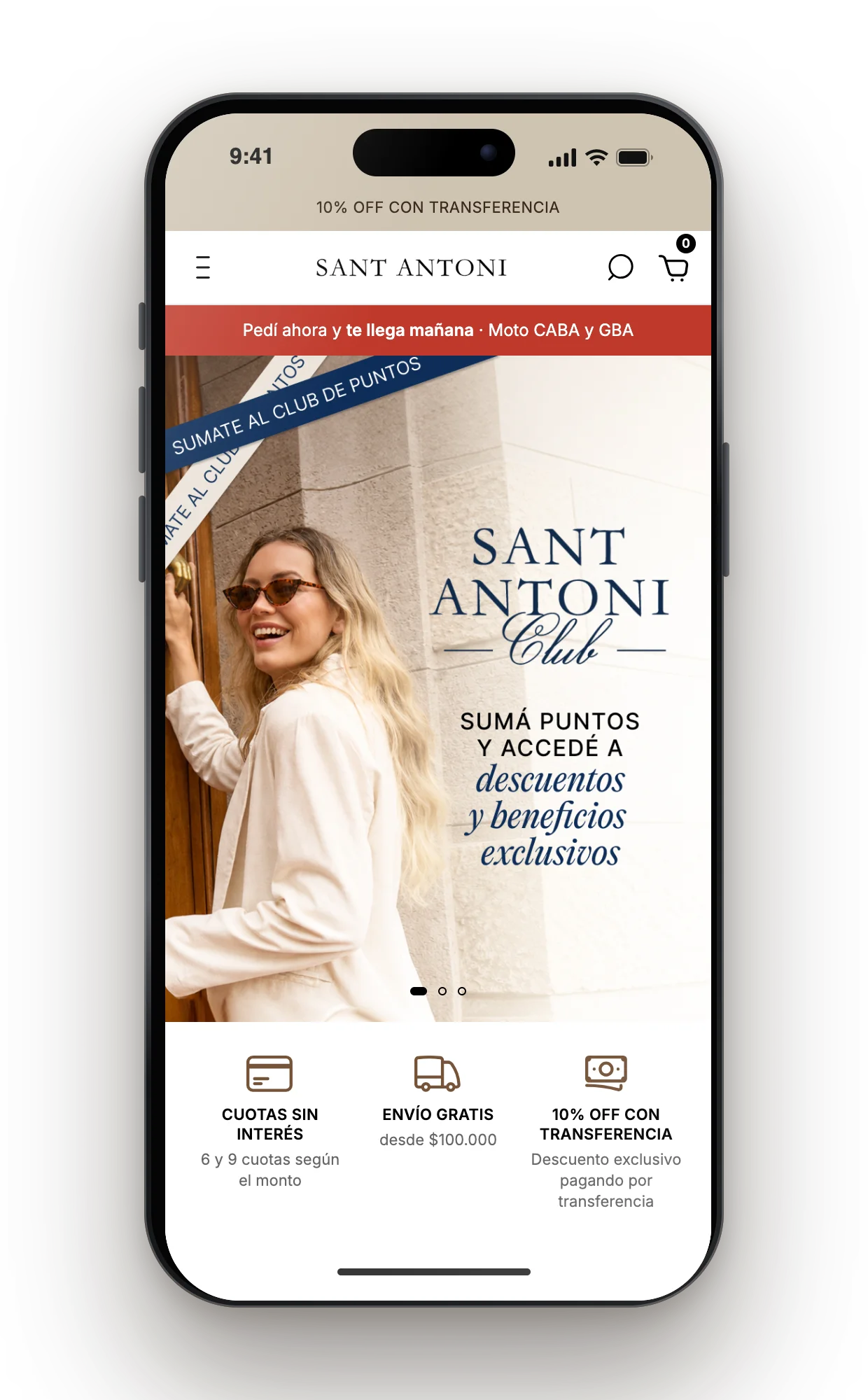
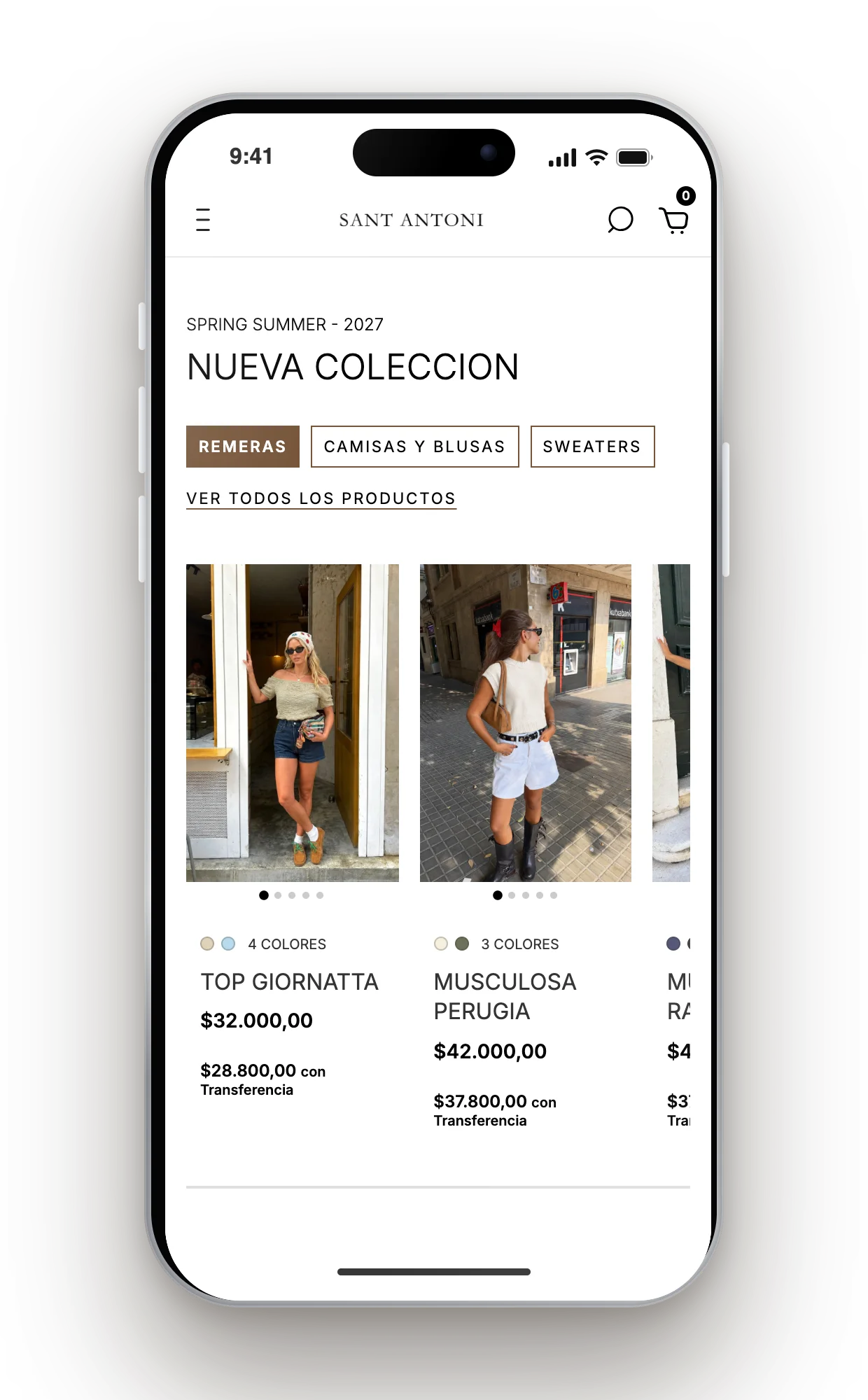
We refined the e-commerce experience through UX research, heatmaps, and CRO strategy. The redesign introduced clearer visual buttons, a sticky checkout, improved navigation, a unified visual system, and custom features tailored to the brand's needs.
Before / after
From friction to flow.
 Before
 After
Results
A smoother shopping experience.
96/100
PageSpeed score
The build
A better experience, across every touchpoint.
Is your e-commerce turning traffic into sales?
Let's identify what's creating friction in your shopping experience and turn it into opportunities for improvement.